If you’re a designer working on an iOS app, it’s important to understand the principles of iOS app design. Successful iOS apps have one thing in common: they prioritize user experience. This means that your app’s design should be intuitive, easy to use, and visually appealing. In this article, we’ll cover several important aspects of iOS app design, including how to choose the right color scheme, creating consistent design, using typography and images effectively, and more. We’ll also discuss best practices and common mistakes to avoid, along with examples of successful iOS app designs to inspire your own work.
Understanding the Principles of iOS App Design
Examples of iOS App Design
At its core, iOS app design is all about creating an experience that is easy and enjoyable for users. This requires you to consider a number of factors, including the app’s functionality, target audience, and user goals. Understanding user behavior and trends is also crucial. Elements like button placement, navigation, and color choice can all impact how users interact with your app. Paying close attention to these details can make a big difference in the overall success of your iOS app.
Another important aspect of iOS app design is ensuring that the app is accessible to all users, including those with disabilities. This means incorporating features like voiceover support, adjustable font sizes, and high contrast options. By making your app accessible, you can reach a wider audience and provide a better user experience for everyone.
The Importance of User Experience in iOS App Design
 User experience (UX) is a crucial component of iOS app design. UX involves a user’s perception of the app’s usability, accessibility, and overall value. To provide a great user experience, you need to understand your target audience and their needs. This includes designing with accessibility in mind, making sure that your app can be used by people with disabilities, as well as users with different levels of technical proficiency. Making user experience a priority will help ensure that the app you design is both functional and well-received by its intended audience.
One important aspect of user experience in iOS app design is the app’s visual design. The visual design of an app can greatly impact a user’s perception of its usability and overall value. It’s important to create a visually appealing and consistent design that aligns with your brand and target audience. This includes choosing appropriate colors, typography, and imagery that enhance the user experience and make the app easy to navigate. By prioritizing both the functional and visual aspects of user experience, you can create an iOS app that stands out in a crowded marketplace and meets the needs of your users.
How to Choose the Right Color Scheme for Your iOS App
Choosing the right color scheme for your iOS app is essential, as color has a significant impact on the overall look and feel of an app. Color can also affect user emotions and behavior. When choosing colors, consider your app’s purpose and the emotions you want it to evoke. For instance, blue is commonly used for calmness and trust, while red can suggest urgency or excitement. It’s also important to consider color contrast, as some users may experience difficulty seeing certain colors or color combinations.
Another important factor to consider when choosing a color scheme for your iOS app is the target audience. Different age groups and cultures may have different color preferences and associations. For example, younger audiences may prefer brighter and more vibrant colors, while older audiences may prefer more muted and classic colors. Additionally, certain colors may have different meanings in different cultures, so it’s important to research and understand the cultural significance of colors in your target audience.
Creating a Consistent and Cohesive Design for Your iOS App
A consistent and cohesive design can make your iOS app easier to use and more visually appealing. To achieve consistency, use a consistent layout, typography, and color scheme throughout the app. This helps users feel more comfortable navigating the app and helps reinforce your app’s brand identity. Aesthetic cohesion also requires attention to detail; minor inconsistencies can distract from the app’s overall design and negatively impact user experience.
Another important aspect of creating a consistent and cohesive design for your iOS app is to ensure that the design is responsive and adaptable to different screen sizes. With the variety of devices available, it’s important to make sure that your app looks and functions well on all of them. This can be achieved through the use of responsive design techniques, such as fluid layouts and scalable graphics. By designing with responsiveness in mind, you can ensure that your app provides a seamless experience for users, regardless of the device they are using.
The Role of Typography in iOS App Design
Typography may not be the first thing you think of when designing an iOS app, but it plays an important role. Good typography can make it easier to read and understand the app’s content. Using easy-to-read fonts with clear hierarchies can help users navigate through the content. Similarly, text size, spacing, and alignment all contribute to the overall readability and visual appeal of your app.
Another important aspect of typography in iOS app design is the use of color. Choosing the right color for your text can help convey the tone and mood of your app. For example, using a bold and vibrant color for headings can make them stand out and grab the user’s attention. On the other hand, using a softer and more muted color for body text can create a calming and relaxing atmosphere.
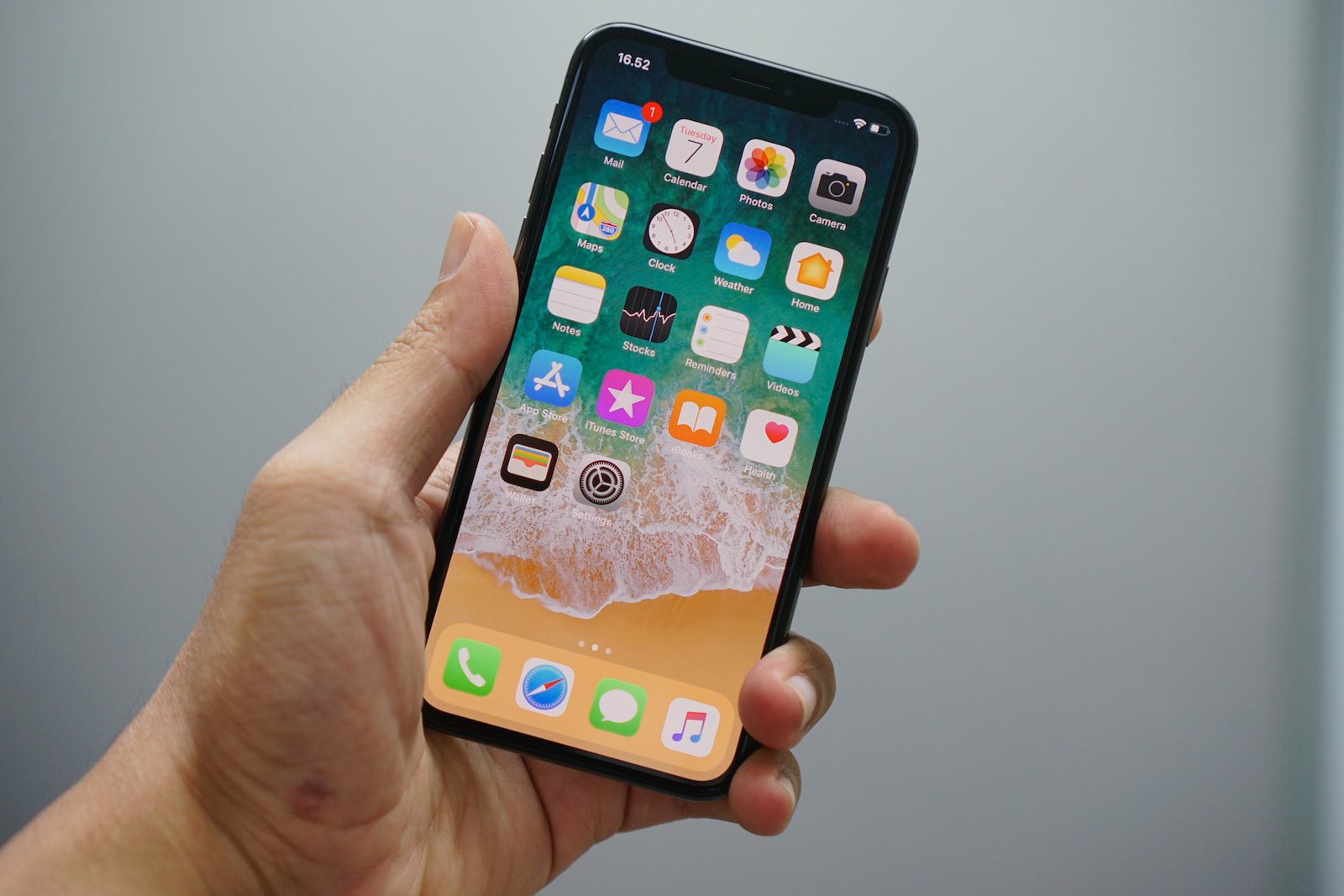
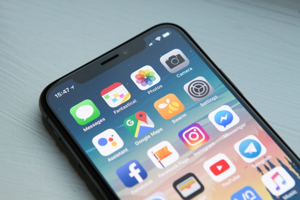
Using Imagery and Icons to Enhance Your iOS App’s User Interface
Images and icons can be used to enhance your iOS app’s user interface (UI) and make it more visually appealing. Carefully selecting images that match your app’s intended purpose can help achieve this goal. Similarly, using icons in place of text can make your app’s interface less cluttered and easier to navigate. Remember that icons should be universally understood, so be thoughtful when choosing icons to ensure your users know what they represent.
When selecting images for your app, it’s important to consider the size and resolution of the image. Large images can slow down your app’s performance, so it’s best to use images that are optimized for mobile devices. Additionally, using high-quality images can make your app look more professional and polished.
Icons can also be used to convey information to users quickly and efficiently. For example, a shopping cart icon can be used to represent a user’s shopping cart, while a magnifying glass icon can be used to represent a search function. However, it’s important to not overuse icons and to provide text labels when necessary to ensure clarity for all users.
Best Practices for Navigation in iOS App Design
Smooth navigation is integral to the success of any iOS app. Proper navigation ensures that users can easily find what they need. Use a clear, uncluttered layout and predictable navigation paths to minimize confusion. Navigation should also be consistent across the app – buttons and menus should function the same way throughout the app. Finally, ensure that your app is easy to use with one hand; if your UI is too cumbersome, users may give up and move on to another app.
Another important aspect of navigation in iOS app design is to provide users with feedback when they interact with the app. This can be achieved through visual cues such as highlighting selected items or providing animations when buttons are pressed. Feedback can also be provided through audio cues such as sound effects or voice prompts. By providing feedback, users are reassured that their actions are being registered and that the app is responding appropriately.
Incorporating Animations and Transitions in Your iOS App’s Design
Animations and transitions can be used to enhance your iOS app’s user experience. Incorporating animations can make the app feel more polished and professional, but it’s important to be thoughtful about where and how you use them. Animations that distract or confuse users may create more problems than they solve. As with any design element, animations should be integrated into the app’s overall user experience considerations.
When incorporating animations and transitions in your iOS app’s design, it’s important to consider the impact on the app’s performance. While animations can enhance the user experience, they can also slow down the app’s loading time and increase battery usage. It’s important to strike a balance between adding animations and maintaining the app’s performance. Additionally, it’s important to test the app on different devices and operating systems to ensure that the animations work seamlessly across all platforms.
Optimizing Your iOS App’s Layout for Different Devices and Screen Sizes
With so many different iOS devices and screen sizes, it’s important to ensure your app’s layout remains optimized. This means designing an app that looks great and functions well, whether users are accessing the app on a smaller device like an iPhone or on a larger iPad. Creating a responsive design is key to optimizing your app’s layout across devices and screen sizes.
One important aspect of optimizing your app’s layout is to consider the orientation of the device. For example, if your app is primarily used in landscape mode, you may need to adjust the layout to ensure that important elements are not cut off or difficult to access. Additionally, you may want to consider using different layouts for different device sizes, to ensure that users have the best possible experience.
Another important factor to consider is the accessibility of your app. This means designing your app in a way that is easy to use for people with disabilities, such as those who are visually impaired or have limited mobility. This may involve using larger fonts, providing alternative text for images, and ensuring that all interactive elements are easily accessible using assistive technology.
Tips for Creating an Engaging Onboarding Experience in Your iOS App
Your app’s onboarding experience is an opportunity to get users excited and acclimated to the app. Make sure your onboarding process is quick and user-friendly. Use visuals and bite-sized explanations to keep the user engaged. Avoid asking for too much up front; some information can be collected later, after the user has already experienced the app. While onboarding content should be informative, it should also be entertaining and engaging, so that users are well-positioned to become long-term users of your app.
Another important aspect of creating an engaging onboarding experience is personalization. Consider tailoring the onboarding process to the user’s interests or preferences. This can be done by asking the user a few questions at the beginning of the onboarding process or by using data from their social media profiles. Personalization can make the user feel more connected to the app and increase the likelihood of them continuing to use it.
Balancing Aesthetics and Functionality in Your iOS App’s Design
Aesthetic and functionality should go hand in hand when designing an iOS app. While aesthetics are important to make an app visually appealing, the app’s functionality cannot be overlooked. The app should be intuitive and easy to use – even if this means simplifying the overall design. For UX to be effective, users need to understand how to use the app quickly and easily. Similarly, while aesthetics are important, including too many unnecessary design elements can lead to confusion and a decreased user experience.
One way to balance aesthetics and functionality is to use a consistent design language throughout the app. This means using the same fonts, colors, and icons across all screens. Consistency helps users understand how to navigate the app and what to expect from each screen. Additionally, using a grid system can help maintain consistency and ensure that elements are properly aligned. By balancing aesthetics and functionality, you can create an iOS app that not only looks great but also provides a seamless user experience.
Staying Up-to-Date with Emerging Trends in iOS App Design
Design trends change and evolve over time, and you’ll need to keep your finger on the pulse to stay up-to-date. But don’t let trends dictate your design process. While it’s important to have your finger on the pulse of what’s happening in the design world, it’s equally important to not let passing design trends negatively impact the functionality and user experience of your app.
One way to stay up-to-date with emerging trends in iOS app design is to attend design conferences and workshops. These events provide an opportunity to learn from industry experts and network with other designers. Additionally, following design blogs and social media accounts can help you stay informed about the latest design trends and techniques.
However, it’s important to remember that not all design trends will be relevant or appropriate for your app. It’s important to consider your target audience and the purpose of your app when deciding which trends to incorporate into your design. Ultimately, the goal should be to create a visually appealing and user-friendly app that meets the needs of your users.
Learning from Successful Examples of iOS App Design
Learning from successful examples of iOS app design can help inspire your own designs. Consider what makes these apps successful – is it the user interface, the navigation, onboarding, or something else? Take cues from successful apps to help ensure that your app is on track for success, while still maintaining your own identity and functionality.
One important aspect to consider when looking at successful iOS app designs is the use of color. Color can greatly impact the user experience and can help to create a cohesive and visually appealing design. Look at how successful apps use color to guide the user’s attention and create a sense of hierarchy within the app.
Another factor to consider is the use of animations and transitions. These can help to create a more engaging and interactive user experience. Look at how successful apps use animations and transitions to provide feedback to the user, guide them through the app, and create a sense of delight and surprise.
Common Mistakes to Avoid in iOS App Design
 Finally, be sure to avoid common mistakes that can negatively impact your app’s user experience. Common pitfalls include cluttered design, poor navigation, and difficult-to-use interfaces. Conversely, when mindful of these common mistakes and employing best practices discussed here, you can create an iOS app that looks great, is easy to navigate, functions well, and provides a seamless user experience.
Overall, designing a successful iOS app takes more than just a great idea or functional code. It requires careful attention to detail, a clear understanding of your target audience and their needs, and a steadfast commitment to providing a great user experience. While there is no one-size-fits-all recipe for success, the tips and inspiration discussed here will help set you on the right path toward creating an unforgettable iOS app.
One additional mistake to avoid in iOS app design is ignoring the importance of accessibility. It’s crucial to ensure that your app is accessible to all users, including those with disabilities. This means incorporating features such as voiceover support, adjustable font sizes, and high contrast options. By making your app accessible, you not only improve the user experience for a wider audience but also demonstrate a commitment to inclusivity and diversity.
 RAK Free Trade Zone P O Box 16111 Ras Al Khaimah, UAE
 Suite 1003-4, Park Avenue, 24A, Blk 6, PECHS, Khi, PK